The very term, responsive web design, tells one what it is. Responsive web design is a type of web design technique which is used to create responsive web sites. A responsive web site responds to its environment. For instance, if you open a website in your desktop computer’s browser, it will be rendered differently from when you open in on a mobile browser. Responsive web design has become a very common approach to website design that almost all websites created these days are responsive. In fact, when one hires someone to design their website, the employers are always looking for a responsive website as the result.
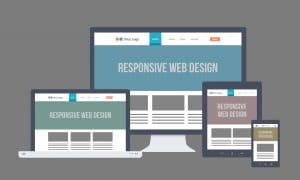
A responsive website is very useful and makes things better for both the designer as well as the end user who opens the said website. Responsive websites have multiple fluid grid layouts which are used according to the device accessing them. There is a different website for every device no matter how small or large. Presently, every well designed website you may come across will be responsive. Making a separate website for every type of device will improve how pages will look on the end user’s device which will improve interaction, readability of the content, and overall aesthetics. Together, these ultimately create a more profound effect on the user as he or she can now access the content a lot more easily and is not restricted by the size of his or her device.
When designing a responsive website, here are some tips which you can follow to make sure your work is simple, sophisticated, and efficient.
Make use of frameworks
- Frameworks save time and make it easy for the designer to design their website.
- Webflow, Foundation, and Skeleton are just some of the many tools available out there to help you build a responsive website quickly and easily.
Start with the smallest device
- When designing your website, start with the smallest device. Then, you can add more content to display as you move to larger devices.
- This will make things easier since you will be progressing from an easier device to a more detailed one.
Make your website modular
- It is always a good idea to make your website modular. Modules help you work with different parts of a website separately and easily without affecting other aspects of the website.
- This is especially helpful when building a responsive website design because you will be able to resize and make changes to the different aspects of your website much more easily.
Take older browsers into consideration
- People around the world still use outdated versions of certain browsers and it is important to take those into consideration so you can reach maximum audience.
By following the best practices which are followed as a general rule by all web developers, you can create quality responsive websites.