The terms adaptive web design and responsive web design are thrown around quite often which leads to confusion. Many people don’t understand how the two styles are different and when they are used. This post is going to address what adaptive web design actually is and how it is useful.
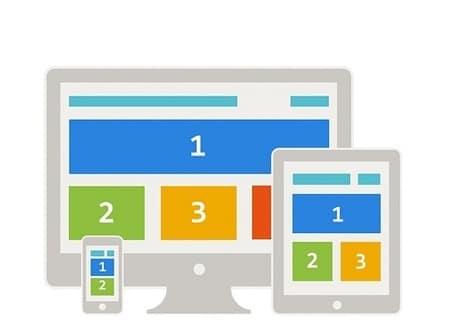 First of all, let us define what adaptive web design is. Adaptive web design is an approach to web design in which a website is rendered differently on different devices. But isn’t responsive web design the same thing? The gist of both design techniques, yes, is the same but the subtle difference lies in how they do it. Responsive web design makes use of creating different websites for different devices based on flexible and fluid grids. Adaptive web design is different. It tackles the problem by relying on predefined screen sizes. The websites designed via adaptive web design technique sets the sizes of its various components based on the type of device detected.
A major difference between the two lies in the code and tools used. Responsive web design uses a flexible foundation and fluid grids. Adaptive web design makes use of a more streamlined, layered approach. Scripting languages are used for adapting the websites to different devices and screen sizes. One can say in adaptive web design, a website “adapts” to the environment rather than “responding” to it. A designer using the adaptive approach will create a set of layouts based on the type of devices which are being used by people around the world. When the device is detected, the layout based on the its screen size is loaded which makes a better and a much more personalized experience for the user. Adaptive web design is based on progressive enhancement rules which is a philosophy stating that one should design for the user and not for the browser.
So, which web design approach should you use? Responsive or adaptive? Technically, adaptive web design is much easier to implement. Responsive web design takes a lot more work because its very foundation is flexible and it uses fluid grids to implement websites. On the other hand, adaptive web design uses a set of layouts which are all loaded first and then based on the type of device opening the website, one is selected and used for display. This also means responsive web design produces a much more flexible and user friendly result when compared with adaptive web design even though it takes a little more work.
Responsive web designs are also easier to load than adaptive web designs which have to load all the layouts before the website picks one of them. In most situations, responsive web design should be the preferred strategy but adaptive web design, being easier to implement should be preferred when you are creating a small website where the delay in loading will not be noticeable.